

Studio: 970 Creative, LLC - Year: 2025 - Industry: Outdoor Lifestyle / Apparel & Gear
BRAND STRATEGY
Alpine Currant is a premium lifestyle and botanical goods brand inspired by alpine landscapes, wild-grown ingredients, and slow living.
The brand brings together products and experiences rooted in nature—whether through botanical products, home goods, wellness offerings, or specialty provisions—under a refined, modern identity.
The goal was to create a scalable brand system that could grow from a single product line into a broader lifestyle ecosystem while maintaining a cohesive visual language.

BRAND ATTRIBUTES
-
Grounded
-
Natural
-
Sophisticated
-
Intentional
-
Modern
-
Restorative
THE CHALLENGE
The challenge was to create a brand that felt:
-
Rooted in nature without appearing rustic
-
Premium without feeling exclusive
-
Modern without becoming cold or corporate
-
Flexible enough to support future product expansion
The identity needed to distinguish itself from both outdoor recreation brands and traditional wellness brands.
THE OBJECTIVES
Success would look like:
-
Creating a distinctive visual identity with strong shelf and digital presence
-
Establishing a scalable brand architecture for future growth
-
Communicating trust, quality, and authenticity
-
Building emotional resonance with consumers seeking balance and connection to nature
-
Developing a cohesive system that could extend across packaging, digital experiences, merchandise, and environmental applications

THE AUDIENCE
Primary Audience
Design-conscious adults ages 30–60 who value:
-
Natural ingredients
-
Quality craftsmanship
-
Wellness and self-care
-
Sustainable living
-
Modern design
Many are professionals seeking moments of calm, restoration, and connection in increasingly busy lives.
Emotional Need
The audience doesn’t simply want products.
They want to feel:
-
Grounded
-
Balanced
-
Restored
-
Connected to nature
-
Confident in their choices
The brand needed to create a sense of calm confidence rather than excitement or urgency.
TONE & POSITIONING
Positioning Statement
A modern alpine lifestyle brand inspired by nature’s quiet strength.
Desired Tone
-
Calm
-
Refined
-
Honest
-
Elevated
-
Organic
-
Contemporary
The identity was designed to occupy the space between wellness, design, and nature.
CONSTRAINTS
Strategic Constraints
-
Needed broad appeal across multiple product categories
-
Required flexibility for future brand extensions
-
Needed to feel premium without relying on luxury tropes
Visual Constraints
-
Simplicity and scalability
-
Strong performance at small sizes
-
Adaptability across print and digital environments
Market Constraints
-
Crowded wellness and botanical marketplace
-
Increasing consumer skepticism toward wellness claims
-
Competition from both boutique artisan brands and large lifestyle companies
DELIVERABLES
Brand Strategy
-
Positioning framework
-
Audience definition
-
Brand attributes
-
Tone of voice direction
Visual Identity
-
Primary logo
-
Secondary logo system
-
Iconography
-
Color palette
-
Typography system
Brand Applications
-
Product packaging concepts
-
Social media assets
-
Marketing collateral
-
Merchandise concepts
-
Website direction
Brand Guidelines
-
Logo usage
-
Color standards
-
Typography rules
-
Visual language system


ALPINE CURRANT TRICHOME
Concept
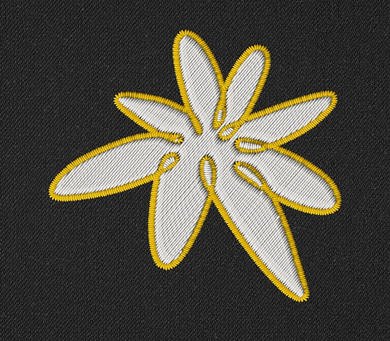
The stones ground the brand in the mountain itself. The edelweiss answers with what survives on it — together they carry Alpine Currant's core idea in two forms.

Studied from verified field specimens, not stock photography, to capture edelweiss's true structure — a double star of bracts around a cluster of florets. Sketched in Procreate, refined toward a bold flat mark, then vectorized for scale.

A flexible secondary mark, from packaging down to favicon size — plus a surface pattern for textiles and merchandise. Left monochrome, the mark adapts to any material — the accent lives in the wordmark instead.
